Practice making graphic logos

Monogram Logos

A monogram logo practice from tutorial using the initials DF 
A take on my own initials JK to make my own monogram logo 
JK monogram logos


Impossible shapes


3D ABC logo made from tutorial

Creating a business card from tutorial

Logo Research Moodboards

Game Logo Moodboard 
3D Shapes & Patterns Moodboard 
3D Typography Moodboard
Logo Analysis

The “PlayStation” logo is a very simple logo using the four simple colours of red, yellow, green and blue. The letter “S” looks as if it is made up of the shadow of the “P” creating an interesting three dimensional illusion. The use of four simple colours helps the logo to stand out on a black or white background without being too complex which gives it a very clean and simple appearance.

“Devolver Digital” This logo’s use of a complex decorative serif typeface in red on a white background helps it to stand out. The use of a spaced out sans serif typeface for the word “Digital” contrasts with the large complex serif of the word “Devolver” which creates an interesting feel to the logo. The combinations of these two typefaces also helps to give a very retro/indie game feel to the logo.
The “Playism” logo uses a simple golden brown colour which helps to make it stand out on a white background. The typeface for this logo is all uppercase in a curved font to help make it flow together and stand out. The use of a circle and a dot to create the “P” for the logo graphic shows a very creative yet simple approach to this logo.
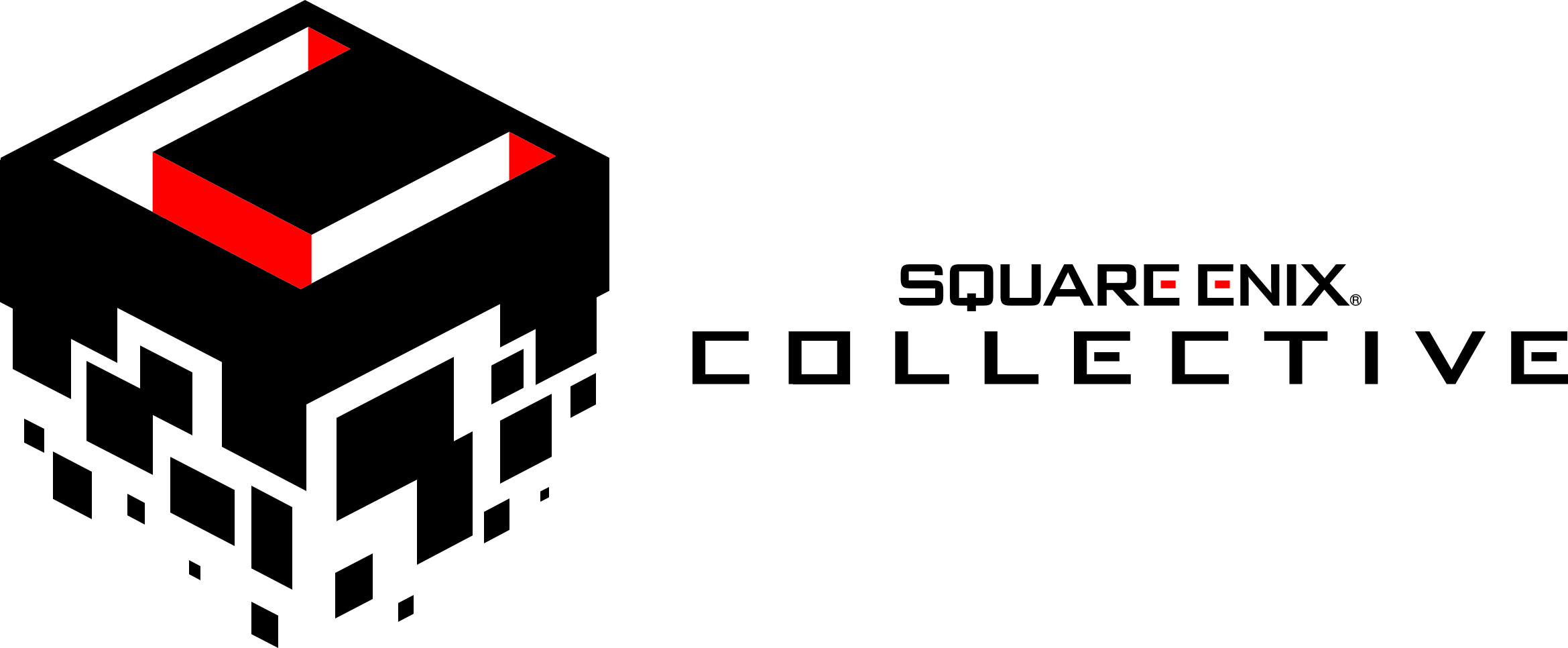
The “Square Enix Collective” logo has a simple yet effective approach to a three dimensional logotype. The logo graphic is a cube that appears to be crumbling into smaller squares at the bottom. There is also a large “C” for “Collective” cut from the top of the cube showing a red and white inside that helps to make this logo stand out. The use of a square typeface for the type in this logo is a simple and creative reference to the company’s name.
Logo Development Sketches


Final Logo Design
For my final logo design I have decided to go with this simple red/blue pentagon with large text. I have used an italic typeface for the word “Angle” to give it an “angle”.
Design Report
Over the course of this Unit I had to design a simple typographic logo for a mock indie game company called “PentAngle”. Throughout my research I found that more simple logos with no more than four different colours are the most effective. I also found that the use of no more than two different typefaces is also simple yet effective. I feel as if I am content with my final outcome as there is little deviation from my initial ideas.
I began this project by looking into different indie game company logos and analysing how their use of typefaces, graphics and colours help to make them stand out among other logos. Through doing this research I found that the use of simple shapes and colours and mixtures of no more than two different typefaces is usually the most effective way to produce a logo like this. I feel as if I have achieved my goal for this project despite not giving myself as much time to complete it as I would have liked.
I feel as if my final outcome for this unit has answered this brief. Although very simple, I feel as if I have produced a clean and effective “PentAngle” logo. To produce my final logo design I used Adobe Illustrator to create a pentagon and cut out a section to give it an “angle” as a simple reference to the company name. I also used two different typefaces, the first being a large bold sans serif for “Pent” and a slightly thinner and smaller spaced out italic typeface for the word “Angle”. If I gave myself more time during this unit to improve my final design I would have attempted to give my final logo some sort of three dimensional effect.
